
Slivers Basics
In Flutter, a sliver is a slice of a scrollable area we can use to achieve custom scrolling behaviors. We can use slivers to achieve custom scrolling effects, such as elastic scrolling. To make it easier for users to view a list of items, we might want to hide the app bar as the user scrolls down the list. This is especially true if our app displays a “tall” app bar that occupies a lot of vertical space.
A “sliver” is a widget that has been designed to be able to work with scrolling views. It is called a “sliver” because it is a slice of a larger view that is being displayed. Slivers are often used in Flutter to create scrolling lists, where each list item is a sliver. Slivers are also used to create scrollable sections within a larger view, such as a header or footer that scrolls along with the main content.
Benefits of Slivers
One of the main benefits of using slivers in Flutter is that they allow for more efficient scrolling performance. Slivers are able to “lazy load” content as it is needed, meaning that they only render the content that is currently visible on the screen. This can significantly improve the performance of large scrolling views, especially on devices with limited resources.
Slivers can be used in a variety of different ways in Flutter, and there are many built-in sliver widgets that can be used to create common scrolling layouts. For example, the SliverList widget is used to create a scrolling list of items, and the SliverAppBar widget can be used to create a scrolling header that sticks to the top of the screen as the user scrolls.
Typically, we create an app bar by providing an appBar property to the Scaffold widget. This creates a fixed app bar that always remains above the body of the Scaffold. Moving the app bar from a Scaffold widget into a CustomScrollView allows us to create an app bar that scrolls offscreen as we scroll through a list of items contained inside the CustomScrollView.
To create a floating app bar, place the app bar inside a CustomScrollView that also contains the list of items. This synchronizes the scroll position of the app bar and the list of items. We might think of the CustomScrollView widget as a ListView that allows us to mix and match different types of scrollable lists and widgets together.
The scrollable lists and widgets provided to the CustomScrollView are known as slivers. There are several types of slivers, such as SliverList, SliverGridList, and SliverAppBar. In fact, the ListView and GridView widgets use the SliverList and SliverGrid widgets to implement scrolling.
here is an example of a sliver list in a CustomScrollView:
Scaffold(
  // No appBar property provided, only the body.
  body: CustomScrollView(
    // Add the app bar and list of items as slivers in the next steps.
    slivers: <Widget>[]
  ),
);
SliverAppBar Widget
Flutter provides the SliverAppBar widget which, much like the normal AppBar widget, uses the SliverAppBar to display a title, tabs, images and more. However, the SliverAppBar also gives us the ability to create a “floating” app bar that scrolls offscreen as the user scrolls down the list. Furthermore, we can configure the SliverAppBar to shrink and expand as the user scrolls.
To create this effect:
- Start with an app bar that displays only a title.
- Set the
floatingproperty totrue. This allows users to quickly reveal the app bar when they scroll up the list. - Add a
flexibleSpacewidget that fills the availableexpandedHeight.
Now that we have the app bar in place, we can add a list of items to the CustomScrollView. We have two options: a SliverList or a SliverGrid. If we need to display a list of items one after the other, we need to use the SliverList widget. If we want to display a grid list, we need to use the SliverGrid widget.
The SliverList and SliverGrid widgets take one required parameter: a SliverChildDelegate, which provides a list of widgets to SliverList or SliverGrid. For example, the SliverChildBuilderDelegate allows us to create a list of items that are built lazily as we scroll, just like the ListView.builder widget.
Under The Hood
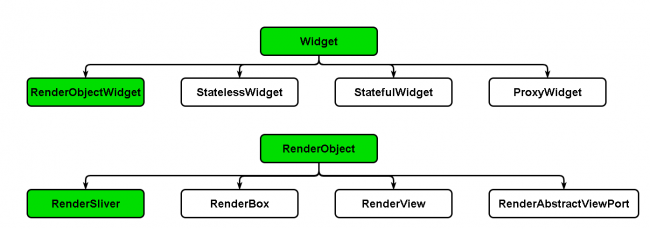
We probably know our way around StatefulWidgets and StatelessWidgets. But they’re not Flutter’s only widgets. Flutter also uses RenderObjectWidgets.
RenderObjecsWidgets act as blueprints that hold the configuration information for RenderObjects. As suggested by their name, these objects are responsible for rendering. They form the basic infrastructure for managing the visual elements tree and defining the layout, painting and composting protocols.
Flutter creates layouts by organizing widgets in trees. When Flutter creates a new widget, the parent widget passes constraint information to its children. RenderObjects work to paint everything.
A RenderBox comprises several RenderObject, like Container or SizedBoxes, and follow box protocol. This protocol lets each widget know its constraints when it’s rendered.
RenderBox only has cartesian corners: width and height. RenderObject paints the layout when a parent object gives its child object the minimum and maximum of both the width and height.
While this works great with boxes, it doesn’t work for scrolling or things like app bar animation and special effects. Consequently, Flutter built a different type of RenderObject for scrolling — RenderSliver. It uses a different protocol, the sliver protocol, to let the RenderObject receive additional constraints from its parent with more axes to ensure the RenderObject only renders when it’s in the viewport.
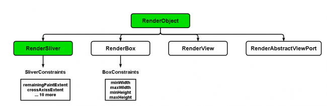
We might ask ourself – why would I want to use a different kind of RenderObject for scrolling? RenderSliver lets us render child widgets lazily or render only the visible portion of the screen. This makes scrolling large lists efficient.
For example, both ListView and GridView use RenderSliver underneath the hood. Anything that scrolls in Flutter uses slivers except OneBoxScrollView as it doesn’t require lazy loading.
SliverFixedExtentList, SliverList and SliverToBoxAdapter
As we may have guessed from their names, SliverList is more generic and flexible compared to SliverFixedExtentList. The latter assumes a fixed extent for its children, while the former doesn’t specify an extent and renders the children widgets with their constraints.
SliverFixedExtentList
A SliverFixedExtentList is a sliver that holds multiple children with the same main-axis extent in a one-dimensional array or linear array. It is more efficient than SliverList because there is no need to perform layouts on its children to obtain the main-axis extent. SliverFixedExtentList does not allow a gap between its children. It requires each child to have the SliverConstraints.crossAxisExtent in the cross axis and the itemExtent property on the main-axis.
A SliverToBoxAdapter is a sliver that can hold only a single box widget. It is useful when we want to display only a single child widget in CustomScrollView to create a custom scroll effect. If we need to display multiple box widgets in a CustomScrollView, we must use the SliverList, SliverFixedExtentList, or SliverGrid.
SliverFixedExtentList is a Flutter widget that allows you to create a scrollable list of items with a fixed item height. It is a variant of the SliverList widget and is optimized for the case where all of the children have the same extent along the scroll axis.
SliverList
SliverList is a widget that creates a scrollable list of items with variable item heights. It is similar to a ListView, but instead of using a single scrollable view, it uses a series of slivers to create the list. This allows for more efficient scrolling, as each sliver is only created as it is needed on the screen.
SliverToBoxAdapter is a widget that takes a single box widget and wraps it in a sliver. This allows you to use a single widget in a SliverList or other scrolling widget. It is often used to add a single item to a list, such as a header or footer.
SliverAppBar
SliverAppBar is a material design app bar in Flutter that integrates with a CustomScrollView. Generally, we used it as the first child of CustomScrollView. It can vary in height and float above the other widget of the scroll view. It allows us to create an app bar with various scrolling effects.
Properties of SliverAppBar
The following are the essential properties of the SliverAppBar:
actions: This property is used to create widgets right of the appBar title. Generally, it is an iconButton that represents common operations.
title: This property is used to define the title to the SliverAppBar. It is similar to the AppBar title to give the name of the application.
leading: This property is used to define a widget left to the title. Generally, it is used to place the Menu Drawer widget.
backgroundColor: This property is used to define a background color to the sliver app bar.
bottom: This property is used to create space to the bottom of the title, where we can define any widget according to our needs.
expandedHeight: This property is used to specify the maximum height to the app bar that can be expanded while scrolling. It must be defined in a double value.
floating: This property determines whether the app bar will be visible or not when the user scrolls towards the app bar.
flexibleSpace: This property is used to define a widget which is stacked behind the toolbar and the tab bar. Its height is the same as the app bar’s overall height.
SliverGrid
SliverGrids organizes children in a 2D arrangement. It can use a delegate or explicit list like SliverList. It also has extra formatting for the cross-axis dimension on a grid. There are 3 ways to set the grid layout:
- Count Constructor counts items on the horizontal axis.
- Extent Constructor specifies maximum width for items, useful when they vary in size.
- Default constructor takes in a gridDelegate parameter.
In Flutter, a sliver is a widget that can be used to create custom scrolling behaviors. Slivers are efficient in large scrolling views because they only render the content that is currently visible on the screen, allowing for better performance on devices with limited resources. There are several types of slivers, such as SliverList, SliverGrid, and SliverAppBar, and they can be used in a CustomScrollView widget to mix and match different scrollable lists and widgets together. The SliverAppBar widget allows for the creation of a “floating” app bar that scrolls offscreen as the user scrolls down the list, and can be configured to shrink and expand as the user scrolls. The SliverList and SliverGrid widgets take a SliverChildDelegate as a parameter, which provides a list of widgets to be displayed in the scroll view.